The best ads don’t look like ads
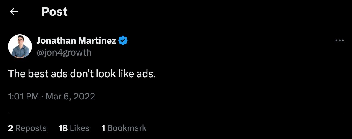
I’ve wanted to write about this topic, ever since posting the following tweet on X (or back then, good ol’ Twitter) in 2022.
@jon4growth X tweet from March 2022.
That’s right, and my stance has not changed. Ugly ads work very well on paid social channels like Meta and TikTok. These are ads that go against the grain of your “normal” looking ad. And maybe, you’re thinking, ugly isn’t the right word. Maybe it’s native. But regardless, the point stands that you want ads that don’t look like ads.
I’m going to keep this brief; a nice and easy read with your morning coffee.
The reason that ugly ads work, is that they look native to a social feed, as if your best friend posted it. It cuts through the noise of all the beautifully-crafted ads that scream “ad!” We’re so far out from the emergence of social channels and digital ads, that people have become trained to spot ads while scrolling through their feeds.
I’m going to start off by showing you a few examples of ugly ads and specific styles to emulate. We’ll then get to how you can work around an audience already trained to spot regular ads.
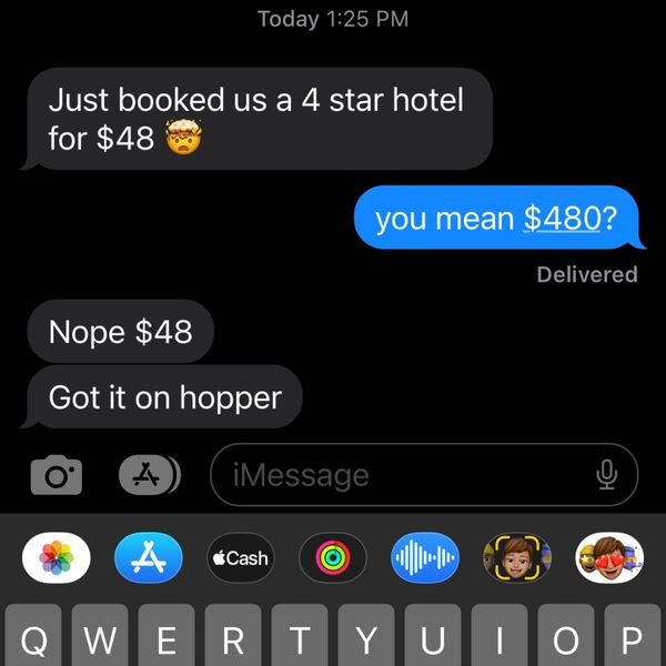
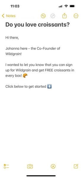
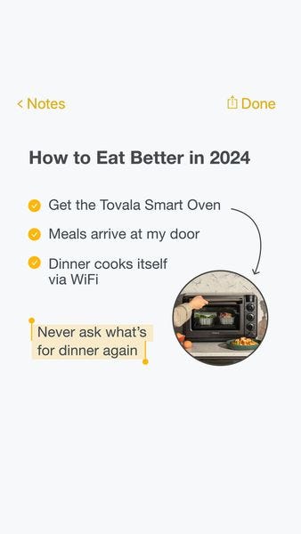
The theme from the above ads is that they’re all screenshots from different interfaces that we’re used to – iMessage, X tweet and iOS’ notes app. They look as if a friend took a screenshot on their phone and posted it on social media for all of their friends to see. That’s exactly what you want. The goal is to make your ads look like a shared conversation between friends.
Okay, ready for a few more?
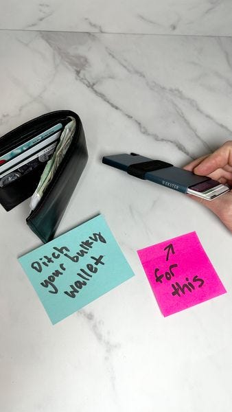
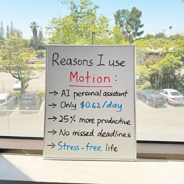
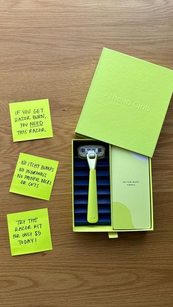
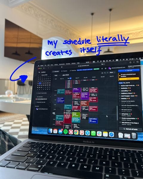
A clever tactic I’ve seen work really well, is using post-it notes or a whiteboard to write your marketing copy, rather than 12-pt font Arial. Take a look.
These cut through the noise really well. The lesson here, is to find new ways to convey the messaging of your product within a creative asset. If you can put your messaging on a Canva or Photoshop asset, you can more than likely also write it on something physical like a notepad.
Okay, here’s the last batch of ads to fuel your inspiration.
The two video ads from above are leveraging a response-interface from TikTok to showcase their products. This feels organic, as creators on TikTok are constantly responding to comments on their videos with reply videos.
I think you get the point – a couple of screenshots and some tweet ads later. These are a few of the styles of ads that took off within the last year and are still going strong. Remember, with the rise of DTC (direct to consumer) brands and advertising over the last decade, trends are constantly changing for one reason: to reduce ad fatigue of users on social platforms.
It’s important to stay with the times and constantly evolve your ads to not look like ads, because again, the best ads don’t look like ads.
If you’re in need of more ad inspiration, check out the free ad library I created over at AdBrownie.com
Extra extra – here’s another ad that I thought was really clever, and I wanted to share with you all.
P.S. if you see any ads in the wild that you think are worth checking out, please contact me on my personal website: jon4growth.com. I’m always looking for the next best ad styles.


